The Healthy Duke logo is designed to be used as a primary or secondary branding element for co-branding with other health and wellness programs. The Healthy Duke brand is intended to serve as a broad umbrella under which all existing and newly developed health/wellness programs for students, faculty, and staff can be represented. The brand works similar to how the brand for a sporting conference like the NCAA or the ACC works with various teams: each team maintains its own independent brands but represents the conference brand to show connection and relationship to the larger network of teams. We encourage the broad use of the Healthy Duke logo to help build awareness of the Duke-wide initiative and establish connection with the hundreds of other existing or newly developed health and wellness programs and resources at Duke. Please follow the guidelines to ensure consistent and appropriate use of the Healthy Duke logo.
General Branding Guidelines
Color
- The Healthy Duke logo should typically be printed posted in four-color process(see RGB and CMYK values below):
- Healthy Duke Logotype
- R-37 G-64 B-143
- C-100 M-90 Y-10 K-0
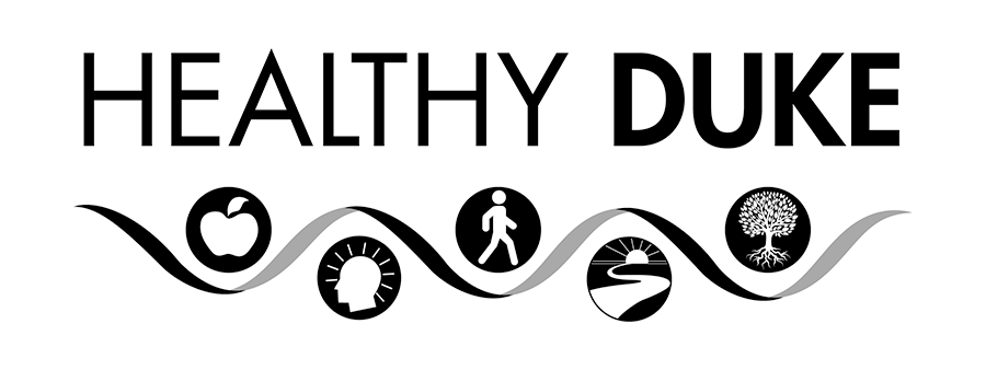
- Apple (red): Food & Nutrition
- R-238 G-31 B-56
- C-0 M-99 Y-82 K-0
- Head (blue): Mental & Emotional Wellbeing
- R-36 G-95 B-157
- C-91 M-66 Y-12 K-1
- Walking Figure (purple): Physical Movement & Fitness
- R-134 G-54 B-148
- C-56 M-94 Y-1 K-0
- Path (yellow/gold): Purpose & Fulfillment
- R-251 G-176 B-64
- C-0 M-35 Y-85 K-0
- Tree (green): Environment & Culture
- R-160 G-185 B-59
- C-43 M-12 Y-100 K-0
- When printing a one-color job, the Healthy Duke logo can be printed in black or any of the CMYK values listed above. It can also be reversed in white out of black or Duke blue (Pantone 287). See Figure 1 below.
Figure 1:
Placement
- When used alone, the Healthy Duke logo must stand alone with no other graphic or text encroaching upon it. Generally, the logo should have at least the space equivalent to half the hight of the letter H around the logo on all sides.
- The website can be listed immediately below the logo as long as the length of the URL equals the length of the logo, and it maintains the same space between it and the icons as the icons are from the text "Healthy Duke."
- When used on top of an image, the logo should be included within a white rectangular box that sets it off from the image. The box should ensure sufficient space around the log. Generally, the logo should have at least the white space equivalent to the width of the letter H around the logo on all sides.
Use of Icons
- The health/wellness icons at the bottom of the Healthy Duke logo represent the five core themes of the initiatives: Food & Nutrition, Mental & Emotional Wellbeing, Physical Movement & Fitness, Fulfillment & Purpose, and Environment a& Culture.
- These icons can be used as individual icons where appropriate to highlight the core theme of a particular program (see Figure 2 below). However, when used as a separate element, the full Healthy Duke logo must also appear on the collateral to show the relationship and context with the overall initiative.
Figure 2:
Modifications
- The Healthy Duke logo should not be modified in any way from the approved versions.
-
- No icon should be added, removed, or replaced.
- The logotype should always be used with the icons beneath.
- Logos can be provided in different formats as needed. Do not try to replicate the logotype, which uses a specific front treatment, or logo.
- The proportions for the logo should be consistent with the original approved files.
- The logo should not be screened back less than 100% or made transparent by any percentage.
Co-branding Guidelines
Color
- The color guidelines for general use apply to the co-branded use as well.
Placement
- The Healthy Duke logo can be used in similar proportions (ie. balanced weight) as the branding element for a different program or as a secondary branding element (ie. smaller and less prominent) to the primary branding element for a related program.
- When the Healthy Duke logo is used as a secondary branding element, it should include the tagline "Another step toward" as part of the logo (see Figure 3 below).
- The tagline "Another step toward" can be place to the left of the logo or above the logo. The logo with the tagline can be provided in different formats as needed. Do not try to replicate the logotype, which uses a specific front treatment, or logo (See Figure 3 below).
Figure 3:
- The tagline "Another step toward" must always be used for co-branding materials when the Healthy Duke logo is the secondary branding element (see Figures 4 below).
Figures 4: